Softphone — Building Product Thinking Into a Visual-First Design Project
Client
Softphone
Year
2022
Softphone is a communication and team-management platform I designed to explore how distributed teams might unify calls, chats, schedules, and project visibility in one coherent product.
While researching enterprise tools, I noticed a pattern: teams juggle separate apps for messaging, scheduling, project tracking, and HR tasks. This concept proposes a unified command center where communication becomes the connective tissue between project management and team coordination.
Scope of Work

Defining the product vision
This project started as an exploration, not a client brief. Inspired by real-world softphone tools — VoIP clients that run on standard devices rather than dedicated hardware — I asked: what would a modern, design-forward version of this product look like if built for today's remote and hybrid teams?
I approached it as a speculative product exercise. Rather than building a single feature in depth, I mapped out the full product surface — onboarding, communications, team management, task tracking, scheduling, and settings — and used the design process to make explicit UX decisions at every screen. The result is a system, not just a collection of screens.
The problem space
Remote and distributed teams increasingly rely on a patchwork of tools: a chat app here, a phone system there, a task board somewhere else. Context-switching is expensive. I aimed to explore what it would feel like to consolidate the most critical team-coordination touchpoints — conversations, calls, contacts, and task status — into a single, low-friction surface.
Defining the product vision
Before opening Figma, I established a theoretical problem space based on common pain points in remote team collaboration: context switching. Users frequently jump between one app for video calls, another for chat, and a third for checking project statuses.
Target Audience: Tech-forward teams, remote workers, and startup environments. Core Product Value: A unified command center that reduces cognitive load by bringing the people, the conversations, and the work into the same contextual environment.
Assumption: Based on typical usage patterns in unified communications apps, I assumed users would need immediate access to their most frequent contacts and upcoming schedule the moment they open the app.
Bringing structure to team workflows
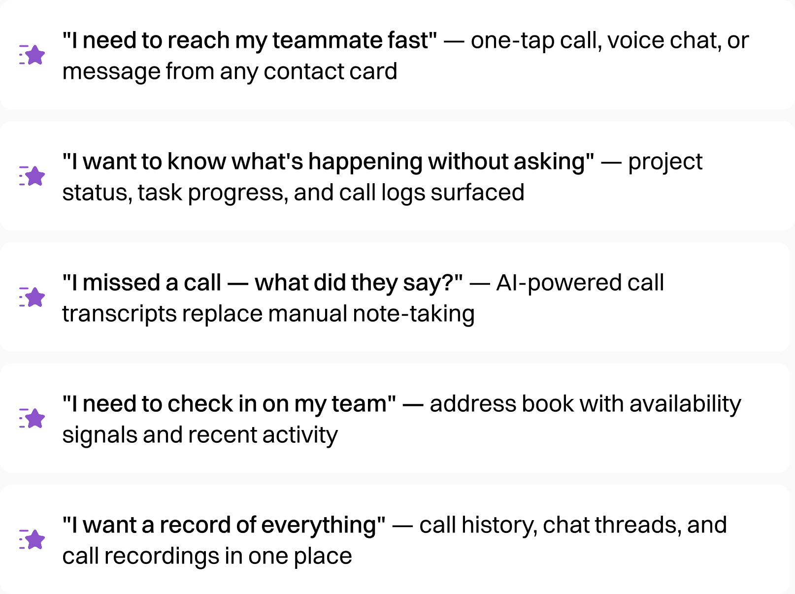
To translate the product vision into a tangible interface, I focused on designing modular features that support daily team workflows. Rather than feature-listing, I mapped the product around what users are actually trying to accomplish:
To prevent the "feature bloat" common in enterprise tools, I implemented a hub-and-spoke navigation model:
Persistent Home: Dashboard serves as the anchor, showing temporal priority (upcoming calls, active projects)
Contextual Secondary Nav: Tab systems within sections (Main/My Team/History in Address Book) allow filtering without leaving context
Modal Workflows: Quick actions (Add Contact, Send Voice Mail) use bottom sheets to maintain spatial orientation

Designing Clarity Across Complex Information
Visual Hierarchy Through Z-Depth
Given the dark UI aesthetic (#0F0F1E background), I relied on elevation rather than heavy borders to separate content layers:
Glassmorphism cards: Semi-transparent backgrounds with subtle blurs (
rgba(255,255,255,0.05)) create depth without harsh contrastAccent color coding: Violet/purple gradients (
#7C3AEDto#A855F7) signal interactive elements and active statesMonochromatic text scale: White (
#FFFFFF) for primary actions, gray scales (#A1A1AA,#71717A) for secondary metadata
Handling Data Density
The Project Status screen illustrates my approach to complex information:
Chart abstraction: Simplified line graphs show trends without precise grid lines (reducing cognitive load)
Temporal grouping: Calendar views use color-blocked events (purple for "Interviews with Clients") rather than text-heavy lists
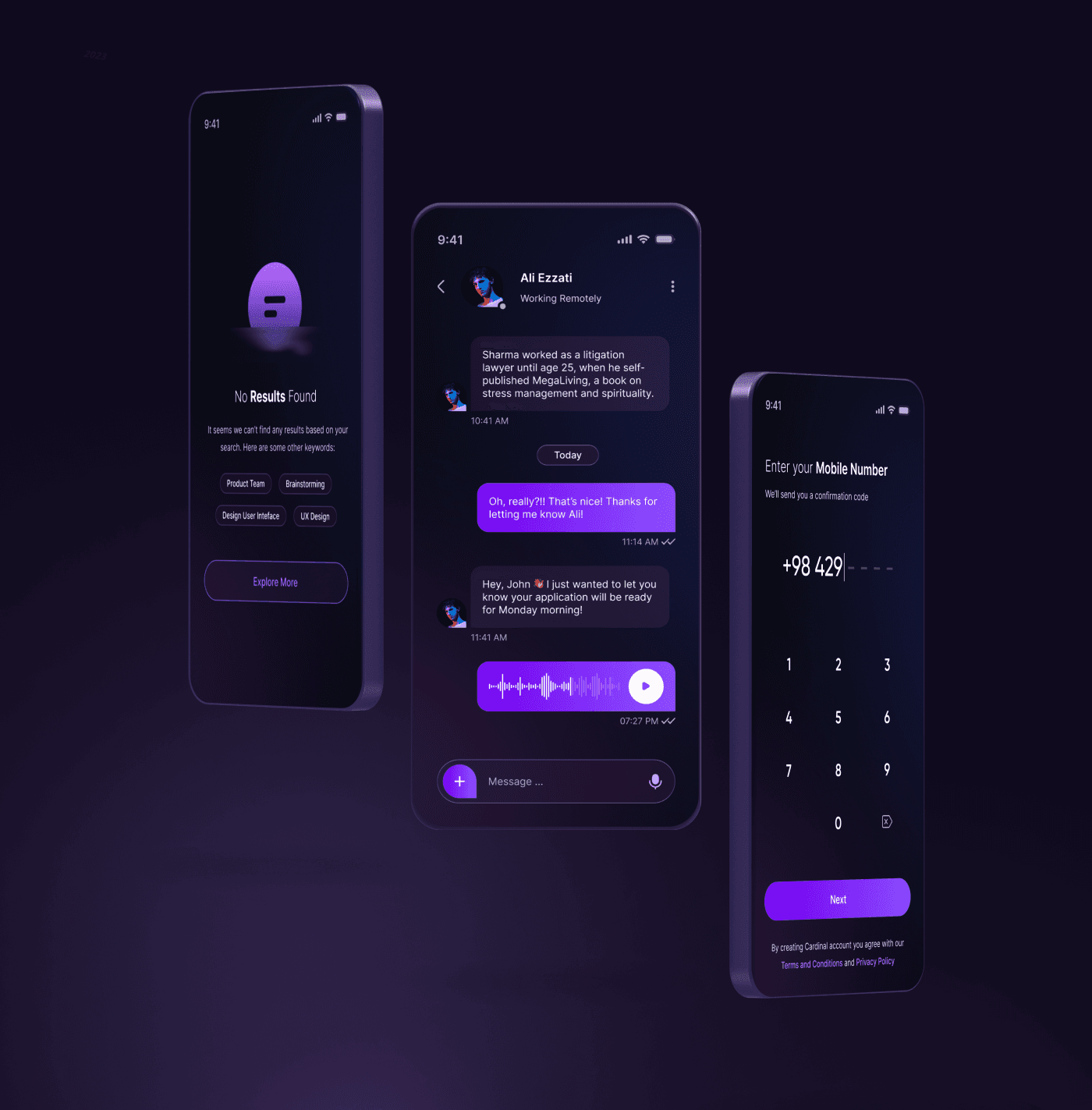
Micro-interactions as feedback: The audio waveform visualization in recorded calls provides immediate recognition of media type

Building consistency through UI systems
What separates a strong portfolio project from a Dribbble shot is evidence of system thinking — the ability to design components that work at scale, not just in isolation. Across Softphone's ~25+ screens, I aimed to establish a reusable visual language.
Component patterns I established
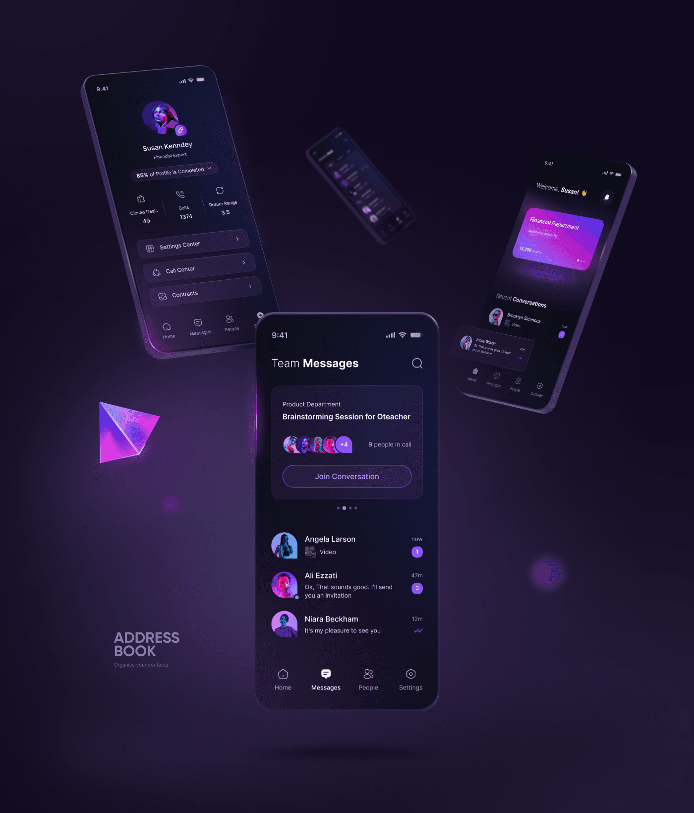
Contact / Conversation Row: Avatar + name + secondary info + inline action icons. Consistent across Messages, Address Book, and call history lists.
Status Pill / Badge: Color-coded status indicators (inbound/outbound, online/missed) used consistently throughout the product with legible label + icon pairing.
Stat Block: Three-metric summary rows on contact profiles (Closed Deals / Calls / Return Range). Reusable for any entity with quantifiable activity.
Modal Sheet: Bottom-anchored overlay used for actions like "Send Voice Mail" and "Add Contact to Team" — consistent dismiss behavior and visual weight.
Tab Bar (Local): Three-tab in-screen switcher (e.g., Main / My Team / History) used across multiple detail views to segment dense information without navigating away.
Primary CTA Button: Full-width, gradient-filled button used consistently for the single most important action per screen. Never more than one per view.

Designing clarity across complex information
A product in this category — communication, people, productivity — needs to feel both premium and immediately legible. I aimed for a visual style that communicates "this is a serious tool" without feeling cold or enterprise-grey.
Visual hierarchy
Across all screens, I used a three-tier typographic scale: a large, bold display treatment for section headers and key stats; a medium weight for primary content labels; and a lighter, reduced-contrast style for metadata and secondary info. This ensures users can parse the most important information first, even when scanning quickly.
"A well-designed screen should communicate its primary purpose within 300 milliseconds — before the user has consciously read anything."
Where gradient energy is used intentionally
Gradients appear in two contexts: the primary CTA buttons, and the featured card on the Home dashboard (e.g., the "Financial Department" hero card). This scarcity makes them feel earned — they signal high importance or primary action. Everywhere else, surfaces are flat and dark, which makes the gradient elements pop.

Usability considerations embedded in the visual design
Touch targets on all interactive elements appear to be ≥44px, consistent with iOS HIG recommendations for thumb-friendly tapping
Destructive actions (end call, send voicemail) use red as a universal warning signal, distinct from the purple brand palette
Icons are always paired with labels in the bottom tab bar — never icon-only — reducing guesswork for new users
Form fields use floating labels and helper text consistently across onboarding, settings, and request forms
What this project demonstrates
I want to be transparent about what this project is and isn't. It is a concept exploration — a way of demonstrating how I think about products, structure complex flows, and make design decisions in the absence of a full research cycle. It is not a validated product, and I wouldn't claim otherwise in an interview.
What I believe it does show:
Product breadth: The ability to scope and design a multi-surface product with six distinct feature areas that feel cohesive — not like a feature dump.
Systems thinking: Consistent component use, reusable patterns, and a visual language that could scale — not just isolated pretty screens.
UX reasoning: Every layout and navigation decision connects back to a user need or established interaction principle — not just aesthetic preference.
Visual craft: A consistent, high-quality dark UI system with strong hierarchy, purposeful color use, and premium feel appropriate for a communications tool.
What I would do differently with more time
Run at least 5 guerrilla usability tests to validate the navigation model — particularly the four-tab structure and whether "People" as a tab label is clear enough
Define accessibility tokens explicitly — text contrast ratios, focus states, and haptic feedback cues for the call interface
Explore the AI Assistant screen more deeply — it appears in the screens but feels underdeveloped; this would likely be a major product differentiator worth expanding
Document a formal design system with Figma component variants, auto-layout rules, and token definitions