Signup Redesign That Generated ~2M kr in Annual Revenue
Client
Greenely
Year
2025
Greenely is a Swedish smart energy company offering real-time electricity monitoring, smart EV charging, battery storage, and solar solutions through its app. The company's website serves as the primary acquisition channel, directing prospective customers through a multi-step signup flow that ends with identity verification via Swedish BankID.
This case study documents the end-to-end UX redesign of that signup experience — from initial discovery through research, design, and implementation — resulting in a conversion rate improvement from 6.8% to ~15%.
Scope of Work

A leaking funnel in a competitive market
When I joined the team, the signup flow had a conversion rate of just 6.8% — meaning more than 9 out of 10 visitors who started the process abandoned it before completing. For a business where signups directly translate to energy contracts and recurring revenue, this represented a significant and measurable opportunity.
The existing flow suffered from two interconnected issues:
Low conversion rate — the funnel was losing the vast majority of interested users before they completed registration.
Weak visual and UX structure — the interface lacked clarity, trust signals, and user-centric framing that would encourage completion.
The challenge was not simply visuals. It needed a thorough analysis of where users were dropping off and why — followed by evidence-based design decisions to address those specific friction points.
Reading the signals users left behind
Rather than jumping to solutions, I started by listening to what the data was already telling us. A multi-layered investigation combined quantitative funnel analysis, qualitative session observation, heuristic evaluation, and competitive benchmarking — each layer sharpening the picture the others had sketched.
Competitive Benchmarking
I mapped the signup experiences of Greenely's closest competitors — Tibber, Lykta, and Fortum — evaluating step count, friction points, feature gaps, and visual distraction levels. The comparison was revealing.
UX Metric / Feature | Tibber | Lykta | Greenely (Legacy) |
Number of Steps | Six (Highly segmented) | Four (Grouped steps) | Four (Dense steps) |
Promo (Discount) Code Integration | No | Yes | Yes |
Moving to a New Address Option | Yes (Asked very early in the flow) | Yes (Asked late in the flow) | No |
Automatic Data Pull (via SSN) | Yes | Yes | No |
Multiple Selection for Contract Type | No | Yes | Yes |
"Produce Electricity" Checkbox | Yes (Identifies solar users early) | Yes | No |
Level of Visual Distraction | Low | Mid | High |
Two patterns stood out immediately. First, both Tibber and Lykta automatically pull user data from the Social Security Number — eliminating the need to manually enter an address. Greenely didn't do this, meaning users were doing work they shouldn't have to. Second, Tibber achieved notably low visual distraction during its signup — a clean, focused environment where the form was the only thing competing for attention. Greenely was rated mid — comparable to Lykta, but trailing the market leader on this dimension.
Funnel Analysis with GA4
Google Analytics 4 gave us the quantitative story. By examining the step-by-step funnel, we could pinpoint exactly where users were abandoning the process — and by how many.
The data pointed immediately to Step 1 as the critical drop-off point. This was the step where users were simultaneously asked to provide their full name, Social Security Number, address, phone number, and email. Five fields. On first contact. Before any trust had been established.

Heatmaps & Session Recordings
Numbers show you where users drop off. Recordings show you why. Hotjar session recordings and heatmaps transformed abstract funnel data into vivid, human behavior.
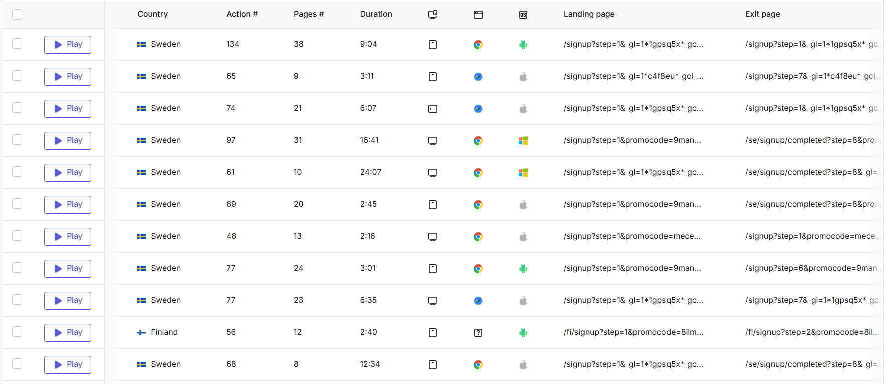
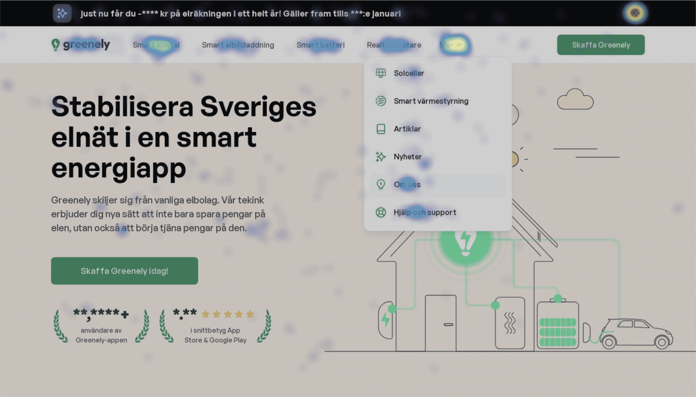
The heatmap confirmed that the problem wasn't awareness of the signup path. The issues began inside the flow itself. Session recordings revealed four recurring behavioral patterns:
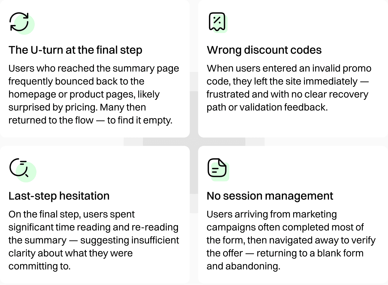
Also some common patterns emerged:
Users hesitated when encountering too many fields at once
Many left the flow mid-process, often navigating to other pages
Returning users were forced to restart from scratch, leading to frustration
Sensitive inputs (e.g. social security number) triggered visible hesitation
UX Heuristic Evaluation
To formalize the qualitative findings, I conducted a structured audit using Jakob Nielsen's ten usability heuristics. This gave a framework for communicating specific problems to stakeholders and prioritising fixes by severity.
H1Visibility of system status: Users had no indication of progress through the form, no way to gauge how much remained, and received no clear confirmation that their data had been saved between steps.H4Consistency and standards: Field labels used imperative commands ("Enter your personal number") rather than human, contextual framing — creating a transactional tone inconsistent with Greenely's brand positioning.H5Error prevention: Invalid discount code entries produced no inline validation feedback — leaving users guessing whether their code was wrong, expired, or simply not applied yet.H6Recognition rather than recall: The summary page required users to recall what they had entered earlier with no ability to review or edit — forcing mental effort at the most critical decision point.H8Aesthetic and minimalist design: The signup page displayed decorative illustrations and product mockups alongside the form — fragmenting attention and competing with the primary conversion goal.

Five targeted interventions
Each design decision flowed directly from a specific observed behavior. Nothing was aesthetic preference — every change had a behavioral rationale tied back to the research.
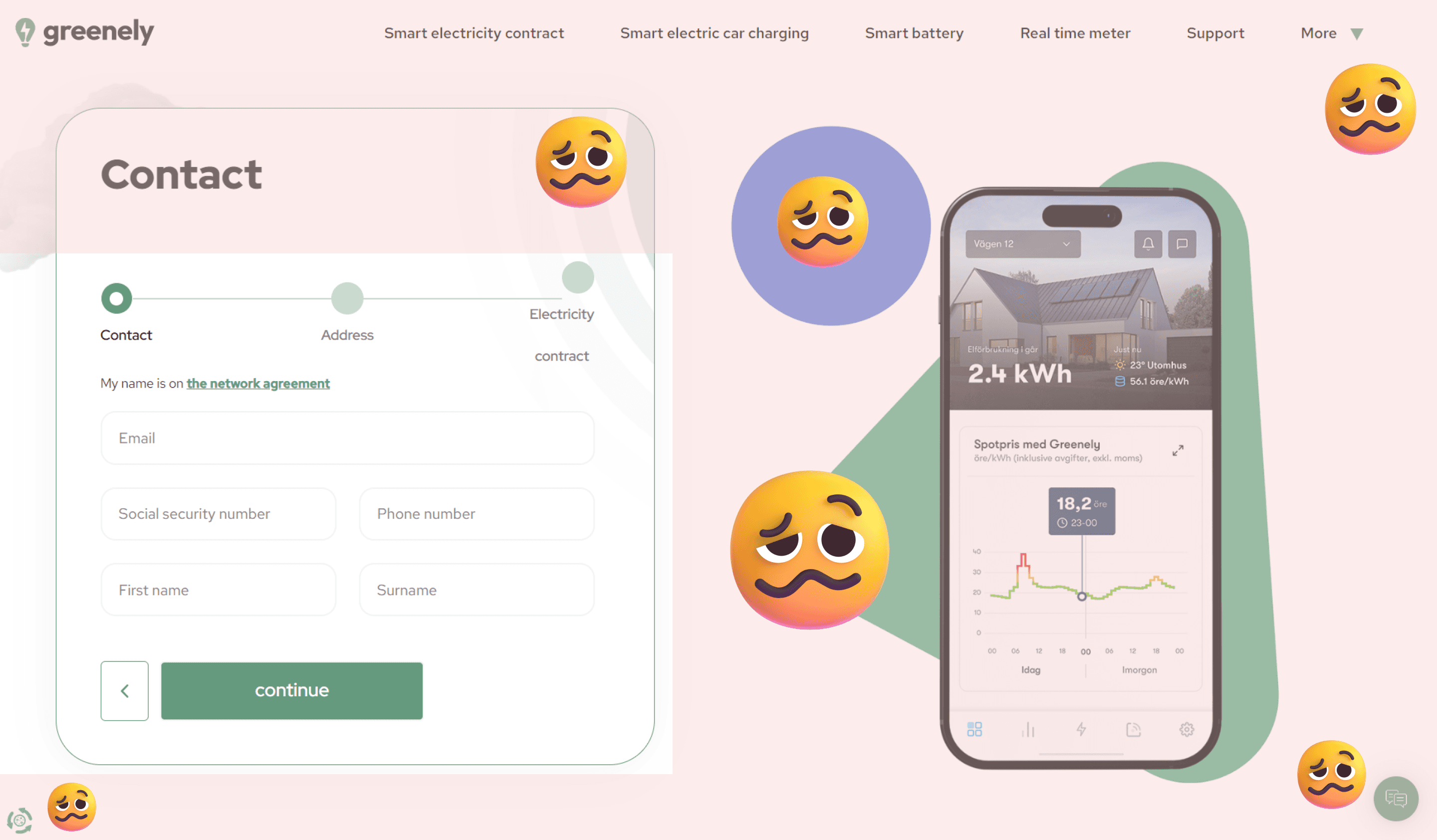
Visual simplicity — removing the noise
The original signup page sat alongside product illustrations and decorative mockups. These elements, well-intentioned as brand reinforcement, actively competed with the form for the user's attention.
The redesign stripped the layout back to a centered, single-column form with no decorative distraction. This aligned with what the competitive analysis confirmed: Tibber — the most focused signup experience reviewed — had the lowest visual distraction rating. The theory was simple: when completing a sensitive financial and personal data form, the only thing that should compete for a user's attention is the next field.
Reframing inputs as questions
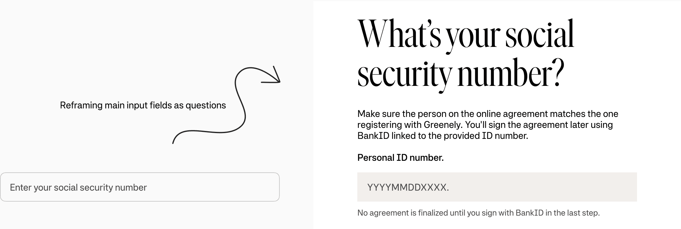
Field labels like "Enter your Social Security Number" have an interrogative, demanding quality — they feel like a form demands, not a service request. In a context where users are being asked for highly sensitive information, this tone creates unnecessary friction.
Each input was reframed as a contextual question accompanied by a brief explanation of why the information was needed and how it would be used. "What's your personnummer?" followed by "We use this to retrieve your address and verify your identity with BankID" shifts the perception entirely — from data collection to service personalization. Trust is built in these micro-interactions.
Progressive disclosure — pacing the ask
The GA4 funnel clearly identified Step 1 as the primary abandonment point. It's no mystery why: users were immediately confronted with five fields covering both personal identity and contact information simultaneously.
The redesign separated personal information from contact details into distinct steps, sequenced to start with the lowest-friction inputs. By the time users reached more sensitive fields, they had already invested effort in the flow — a well-established commitment principle in behavioural design. The early steps established momentum; later steps leveraged it.
Session persistence — honouring the user's work
Session recordings revealed a remarkably common pattern: users who filled out most of the form would navigate away — to check pricing details, read about the smart electricity contract, or simply verify an offer — and then return to find their work gone.
This was a solvable problem. Temporary session storage was introduced to persist form inputs across page navigation. When a user returned, their data was waiting for them. The behavioural change this unlocked was significant: users who needed to verify information before committing could now do so without penalty, removing a category of friction that had been causing a specific and identifiable type of abandonment.
An honest, editable summary page
The final step is where the contract is signed. It should be the moment of greatest confidence — yet session recordings showed it was a moment of hesitation and confusion. Users scanned and re-scanned the page, uncertain what they were agreeing to. Many left to seek more information.
Three improvements addressed this directly. Discount codes were displayed prominently with their applied savings made explicit. All entered information became editable inline — eliminating the need to restart the flow to correct a typo. And the contract terms were surfaced more clearly, with plain-language explanation of what signing actually meant. Together, these changes transformed the final step from an anxiety point into a moment of confirmation.

The numbers that matter
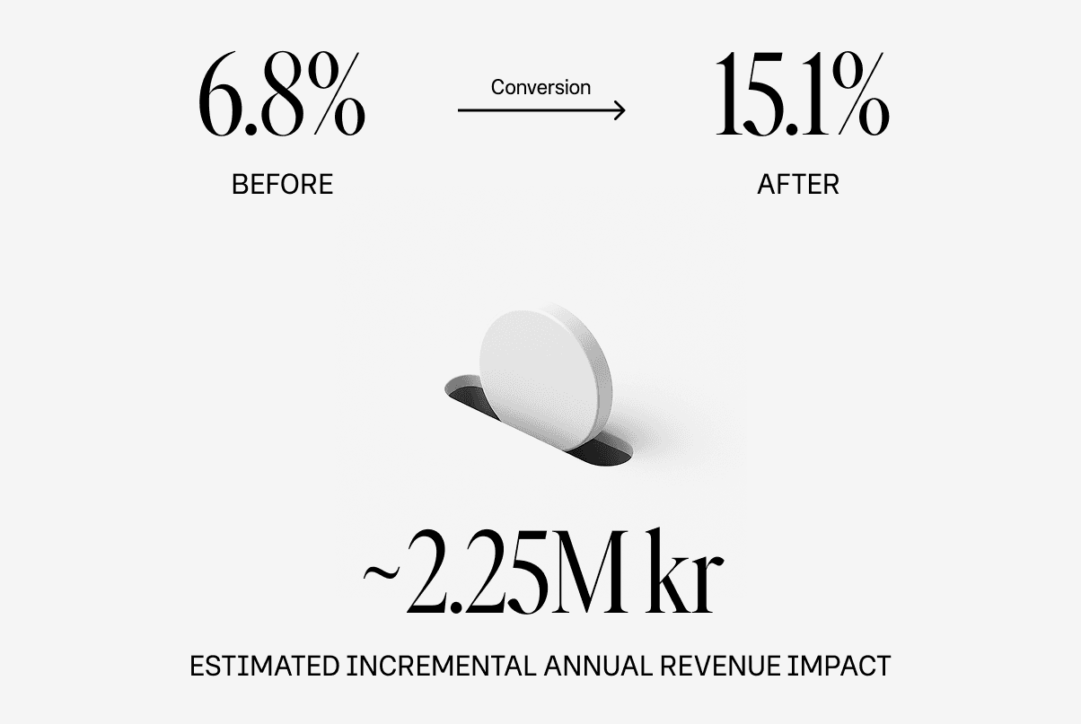
The UX redesign raised conversion from 6.8% to about 15% (≈120% relative increase) by fixing compounding friction (data loss on navigation, an overwhelming first step, last‑mile price uncertainty, etc.). Conversion later rose to ~20% when marketing campaigns brought higher‑intent traffic. In short: the design created the structural improvement; the campaigns amplified it.
How the revenue estimate was derived
Using Greenely's historical business KPI data, the revenue impact of the improved conversion rate can be approximated conservatively. The improvement produced roughly 415 additional signups per month above the previous baseline. With a 12-month LTV averaging approximately 4,500 kr per customer (derived from ARR per active customer and observed churn rates of ~2–2.5%), this translates to approximately 2.25M kr in estimated annual incremental revenue — compounding as those customers remain active.
This figure likely underrepresents the true impact: it excludes secondary effects such as reduced CAC amortization across a larger customer base, improved word-of-mouth conversion from a smoother onboarding experience, and the compounding value of customers retained beyond year one.
The conversion rate improvement delivered more new customers per marketing krona spent — effectively making every existing traffic acquisition channel more efficient without additional spend.
What this project demonstrated
This project is a case for starting with evidence before reaching for solutions. Every significant design change had a corresponding data point — a funnel step, a session recording, a heuristic violation — that made the rationale concrete and defensible.
It also demonstrated that conversion optimization on sensitive, multi-step flows is rarely about making things look better. It's about systematically identifying the specific moments where trust breaks down, effort spikes, or context is missing — and removing those obstacles one by one.
This wasn’t just a UI redesign.
It was a product thinking exercise — aligning user needs, business goals, and behavioral insights into a cohesive experience.
And most importantly:
It demonstrated how thoughtful UX decisions can directly impact revenue.