How an AI-Powered Design System Accelerated Delivery by 60%
Client
Greenely
Year
2025-2026
Greenely helps households across Europe monitor, optimize, and control their energy consumption—from real-time electricity tracking to smart EV charging and solar battery management. The product was working. Users were coming. But behind the scenes, the experience was cracking.
This is the story of how we went from eleven button styles and no shared language to a unified design system, a redesigned app, and a workflow where designers ship production code. It covers the audit, the system, the adoption strategy, the redesign — and the role AI played in changing what designers can actually do.
Scope of Work
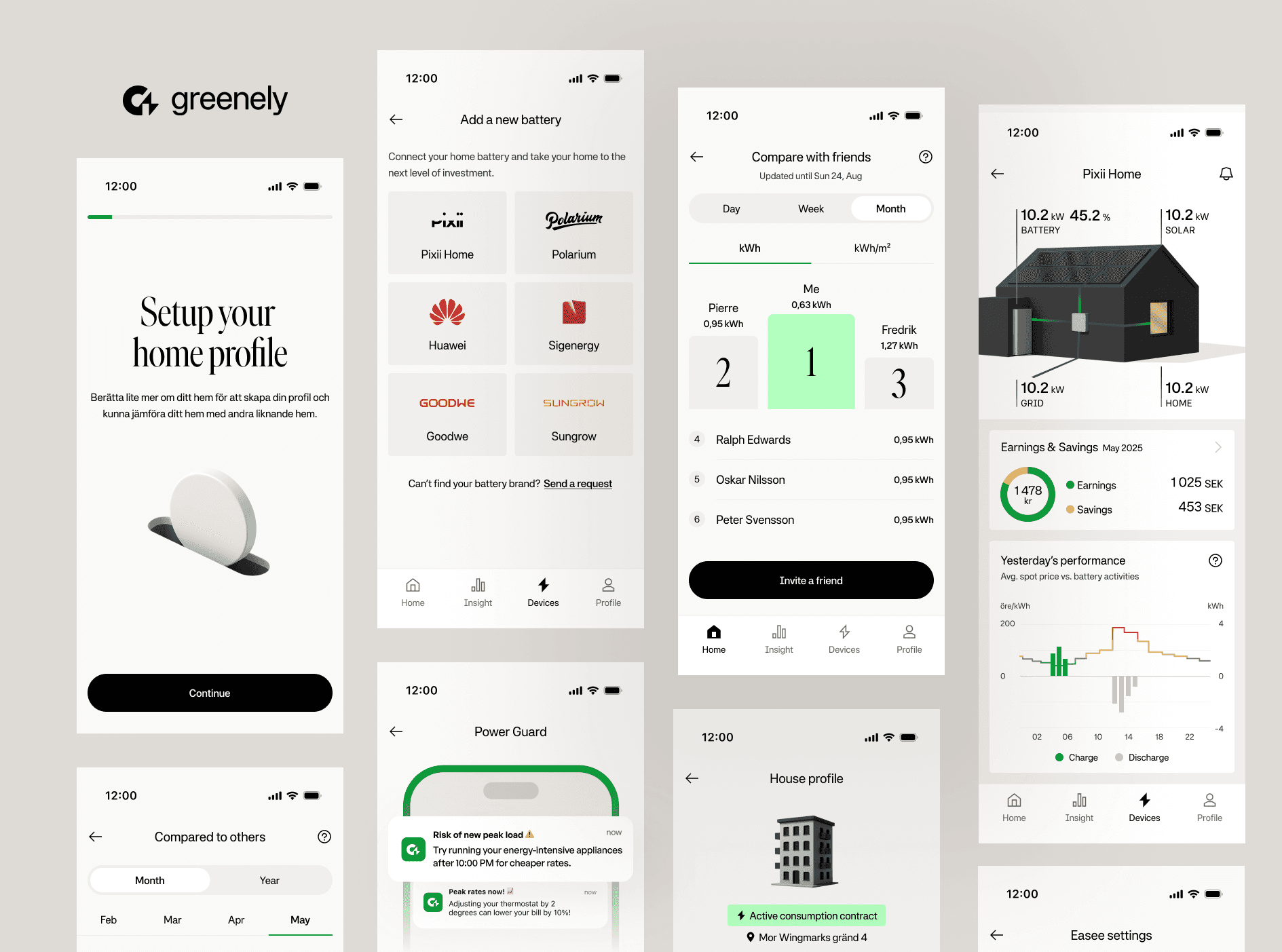
The Problem: A product was growing faster than its UI
But by the time I joined the team, the app had a problem that no new feature could fix. Years of iterative releases, rotating contributors, and the natural pressure of a fast-moving startup had left the product visually and structurally fragmented. Not broken — just inconsistent in ways that quietly accumulated into a real cost.
The company was also expanding across Europe. Sweden was live. Finland, Denmark, and the Netherlands were next. That kind of growth demands a system that can scale — localization, accessibility, multi-platform consistency. What we had was a patchwork.
"The real problem wasn't just visual inconsistency. It was an organizational problem wearing a design costume."
There was no shared design language. No single source of truth. Designers, engineers, product managers, and marketing were all making slightly different decisions with slightly different assets — and none of it was obviously wrong. It just wasn't the same.

Finding the patterns behind the inconsistency
Before touching anything, we needed to understand the real scope of the problem. Not by feeling — by counting.
We ran a structured UI audit across every screen in the app. The goal wasn't to create a list of things we disliked. It was to identify what was actually happening at scale, and where the design-to-engineering handoff was breaking down most.
Our audit surfaced patterns that had become invisible through familiarity, for instance, including:
Different variations of buttons across the app—different heights, corner radii, color treatments, and loading states
Typography chaos: four different "heading" styles that were visually indistinguishable to users but technically distinct in code
Missing systemic states: error messages that looked different in every flow, empty states that felt like afterthoughts, disabled interactions that confused more than clarified
Spacing inconsistency: margins that followed no grid, creating subtle but cumulative visual noise
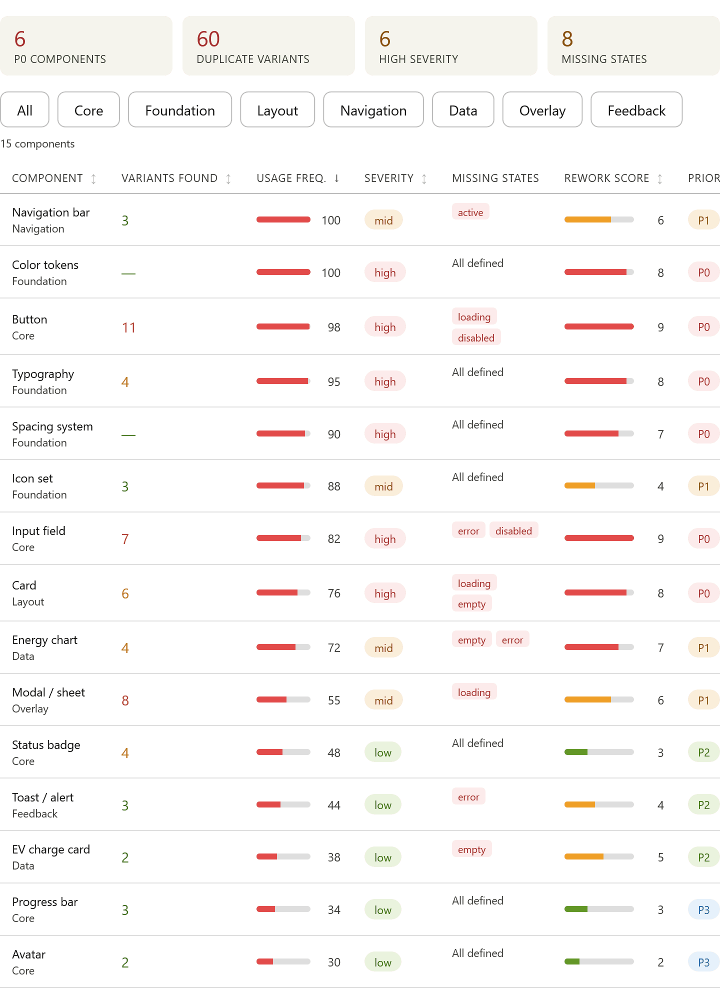
The audit gave us two things: a shared vocabulary for the problem, and a prioritization map. We knew which inconsistencies were most frequent, which had the greatest user impact, and which were burning the most engineering time. That shaped everything that came next.
Building the system
The audit pointed to symptoms. The design system needed to address the cause: there was no shared decision-making infrastructure. We weren't going to solve this by redesigning individual screens.
We started at the foundation and worked outward — tokens first, then components, then patterns. Every decision made at the token level would propagate automatically through everything built on top of it. That leverage was the point.
Tokens: the decisions underneath the decisions
We structured our tokens around the four areas of the UI where color decisions actually get made: background, text, icon, and border. Instead of naming by value — green or #009A33 — every token carries its context. color-text-disabled tells you where and why, not just what. That distinction matters more than it sounds: when a designer or engineer reaches for a color, the token name makes the right choice obvious and the wrong one harder to make by accident.
Dark mode was already on the customer roadmap, so we built for it from day one. Every base color was mapped to both light and dark variants — color-background-primary resolves to white in light mode and near-black in dark. No component would ever need to be re-colored manually; flipping the theme would just work. We weren't designing for the feature we had. We were designing for the one that was coming.
The same thinking applied across every layer of the foundation. The spacing scale runs on a 4px base, giving the team a constrained set of options — spacing-xs at 12px, spacing-m at 24px, spacing-huge at 64px — so layout decisions had a shared grammar instead of arbitrary pixel values. Corner radius followed the same logic: five steps from radius-none to radius-full, each with a clear use case. Typography split across two typefaces with explicit rules — Ivar for high-impact display moments, Systemia for everything the user reads to get work done — with a full scale from Body Small at 12px up to Headline Huge at 60px. Each token was a decision made once, consistently, everywhere.

Components built for completeness, not just appearance
Every component was built with all states defined from the start: default, hover, active, disabled, loading, error, and empty. This sounds obvious — but it was the single biggest source of rework in the old process. Engineering would get a spec with three states, then spend days in back-and-forth asking "what does this look like when it's loading?"
We didn't try to build everything at once. We triaged the component backlog by three criteria: frequency of use (how often does this appear in the app?), cross-team value (how many teams need this?), and engineering fragility (how often does this cause rework?). That gave us a clear sequence and meant the system was delivering value within weeks, not months.

The Game-Changer: Bridging the gap with AI
One of the most significant shifts in this project wasn't about the design system itself — it was about how we interacted with production code for the first time.
Using Claude Code, we as designers began contributing directly to the Flutter widget implementations. Not writing full features from scratch — but making real, reviewable code contributions: adjusting spacing, implementing component states, wiring up tokens, building new screens from the system's building blocks.
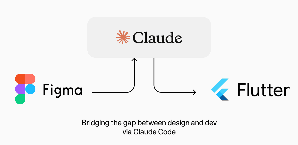
The result: design QA — which had historically been a dedicated back-and-forth loop of "this isn't pixel-perfect" — was nearly eliminated. Designers weren't handing off a spec and hoping. They were shipping the thing, and engineers were reviewing it. The relationship between the two disciplines fundamentally changed.
What this unlocked in practice
Before | After |
|---|---|
Design hands off a Figma spec | Designers implement from system tokens |
Engineer interprets and implements | Engineers review the PR directly |
Design reviews, finds gaps | Single review cycle |
Back-and-forth iterations | System constraints prevent drift |
QA cycle adds days per feature | QA overhead near zero |
This wasn't about replacing engineers. It was about shrinking the translation layer between design intent and production reality. We became more technical. Engineers spent less time on implementation ambiguity. And the system enforced consistency in a way no review checklist ever could.
Getting it adopted (Without breaking things)
The hardest part of this project wasn't building the system — it was making sure the organization changed its behavior because of it. You can’t just flip a switch on an app that thousands of users rely on daily to monitor their energy costs. A "big bang" redesign was too risky.
"We deliberately avoided a big-bang rollout. Replacing everything at once is how systems die in the adoption phase."
Instead, we designed a phased adoption model. New features were built using system components from day one. Existing screens were migrated incrementally — prioritized by user traffic and engineering touchpoints. Nothing was ripped out until a replacement was ready and battle-tested.

Redesigning the app on top of it
Once the system was stable and adopted, the redesign wasn't a project — it was a consequence. We had a coherent foundation. We had components that all spoke the same visual language. We had patterns that users had already validated through the beta rollout. The question wasn't whether to redesign the app. It was how far to push it now that we had the infrastructure to do it right.
The redesign focused on three things the system enabled but the old interface had never resolved: information hierarchy, layout clarity, and UX consistency across the energy management flows.

What the system made possible in the redesign
One of the frequently raised complaints in customer feedback was poor navigation — users struggled to find device controls and real-time data quickly, often buried several taps deep into the app. The home screen prioritized a single scrollable feed rather than giving users immediate access to what mattered most in the moment.
The first round of the app redesign addressed this directly by transforming the home screen into a modular dashboard of real-time device and stats cards, anchored by the spot price chart users already relied on. Each card delivers a live snapshot of a connected device or key metric — solar output, battery discharge rate, EV charging status, inside temperature — and tapping any card opens its dedicated detail screen for full historical data and device controls. This two-level hierarchy resolved the navigation complaints without adding complexity: the dashboard is the shortcut layer, and everything else is one tap away.
To take it a step further, users can also reorder the cards to match their own priorities — putting what matters most to them within the viewport of their device. For a user who primarily cares about their EV charging status, that card sits at the top. For someone focused on solar production, same logic. It's a small but meaningful personalization that shifts the experience from a one-size-fits-all dashboard to something that feels genuinely tailored. In the next steps we redesigned the main navigation tabs.
Localization readiness built in
With expansion into Finland, Denmark, and the Netherlands on the roadmap, the redesign had to work in multiple languages from day one. Because we'd built the component system with flexible text containers, minimum touch targets, and locale-aware spacing, adapting screens to new markets took hours, not weeks. The design system was the localization strategy.
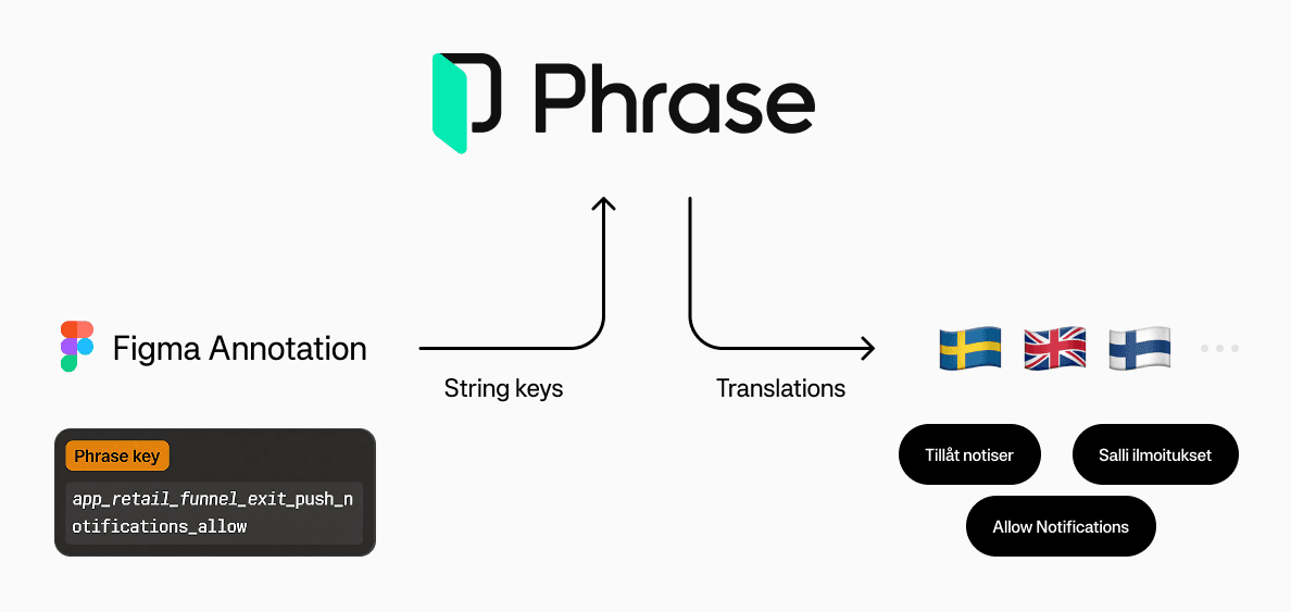
Impact: Measuring the Transformation
The metrics tell the rest of the story. Let's take a look at them from three perspectives.
Got it — here are the three tables formatted cleanly for copy-paste:
For the Team
Impact | Detail |
|---|---|
60% reduction in time from design to shipped feature | The system eliminated the specification, interpretation, and rework loop that had been burning cycles on both sides. |
Near-zero UI QA overhead | With designers contributing directly in Flutter via Claude Code, there was no gap between design intent and production output. |
New team members productive in days, not weeks | The system was the onboarding. Every component was documented, every pattern had a rationale, every decision had a source of truth. |
Fewer duplicate components across the codebase | Engineering no longer needed to build one-off UI elements. The system covered it, or it prompted a documented system extension. |
For Users
Impact | Detail |
|---|---|
Improved task completion rates in key flows | Consistent interaction patterns meant users didn't have to re-learn behavior screen to screen. |
Reduced drop-offs in the EV charging setup flow | Unified form patterns and error states made a technically complex flow feel manageable. |
Better accessibility baseline across the app | Tokens encoded contrast ratios and touch targets from the start; accessibility wasn't an audit pass, it was built in. |
Higher perceived quality and trust | Visual consistency, even when users can't articulate it, correlates directly with trust in the product and the data it's showing. |
For the Business
Impact | Detail |
|---|---|
Scalable foundation for European expansion | Localization-ready components made entering new markets a configuration exercise, not a design sprint. |
Contribution to improved retention and engagement metrics | A more consistent, trustworthy app experience reduced friction in the core energy monitoring loop. |
Reduced cost of change | When product strategy shifted (new energy product, new market), the system absorbed the change rather than requiring a rebuild. |


Final words and reflections
Building a design system is often framed as a technical exercise. This project taught me it's fundamentally an organizational one.
The hard parts weren't defining tokens or building components. They were:
Convincing stakeholders that slowing down to build infrastructure would speed us up later
Changing team habits that had formed around workarounds to the old fragmentation
Letting go of pixel-perfect Figma control in favor of code-based collaboration
Maintaining momentum when the work was important but invisible
The AI-assisted development model was crucial here. By enabling designers to work directly in code, we didn't just speed up delivery—we changed the relationship between design and engineering. Less handoff, more partnership. Less "designing for implementation," more "designing as implementation."
The app redesign was the visible outcome. But the real product was the capability to move fast without breaking things—to scale experience quality as the business scales.
That's the promise of design systems done right. Not just better buttons, but better business.
This case study documents work completed as part of a three-person design team at Greenely. All metrics and outcomes reflect actual project results.